CSS box model and more
Contents
CSS box model and more
See the code at the bottom and try it out.
Box model
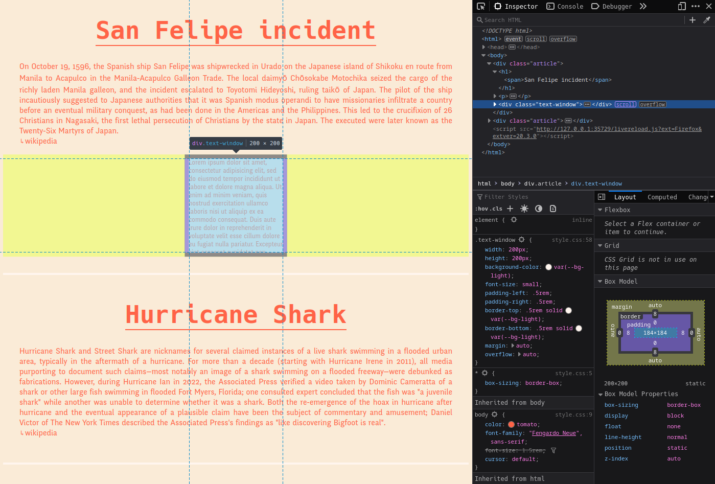
The display of every element is defined by the box model. It consists of the content of the element, a padding, a border and a margin. You can inspect the box model of each element with the Inspector of your browser:
In this case the content is 184x184 Pixels big. It has a padding of 8 on the left and the right and a border of 8 at the top and the bottom. The margin is set to auto. Using auto as left and right margin will center an element.
Margin
.text-window {
    margin: auto;
}
The margin defines the space between the border and the neighboring elements. If only one value is set, it defines all 4 sides, otherwise you can define them individually:
div {
    margin-top: 10px;
    margin-right: 15px;
    margin-bottom: 20px;
    margin-left: 15px;
    /* or all together in one line */
    margin: 10px 15px 20px 15px;
}
By default the body element has a left and right margin. You can inspect it with the inspector. It’s helpful if you don’t style anything, otherwise it may be better to set it to 0:
body {
    margin: 0;
}
Or via unset which is also helpful to deactivate styling that comes from CSS frameworks:
body {
    margin: unset;
}
Border
.text-window {
    border-top: .5rem solid var(--bg-light);
    border-bottom: .5rem solid var(--bg-light);
}
(For different border styles see this page. For defining rounded corners see this page.)
Padding
The last part of the box model is padding. This area is in between the content and the border.
.text-window {
    padding-left: .5rem;
    padding-right: .5rem;
}
box-sizing
If we use margin, border and padding that way, all these values will be added to the size of our element.
overall_width = width + padding-left + padding-right + border-left + border-right + margin-left + margin-right
Sometimes this is difficult to control, for e.g. if we want to create a grid with three columns or if an element should have a fixed overall size for any reason.
One solution is to use the box-sizing property. Commonly it’s applied to all elements with the following code at the beginning of a .css file:
* {
    box-sizing: border-box;
}

.text-window {
    width: 200px;
    height: 200px;
}
With box-sizing set to border-box the width and height of the whole .text-window element will be 200x200, no matter what padding, border and margin is set. Here the actual size of the content is 184x184 (with 2 x 8px border/ margin it will fill the 200px).
Variables
If we use values like a color multiple times inside a stylesheet, it may be useful to work with a variable. Commonly variables are defined in the pseudo-element :root. Pick names of your choice and associate data to it:
:root {
    --bg-light: seashell;
}
After that the variables (in this case bg-light) are available through the function var():
.text-window {
    background-color: var(--bg-light);
}
For more information see for e.g. this article at MDN.
Overflow
If the size of an element is not specified, it will fit to the content. For e.g. a p will be as big as necessary to contain all the text. If a element has a fixed size like the .text-window container, the content may leak out. See it if you remove the overflow:auto setting from the class. Overflow set to auto will activate the scroll behaviour if necessary.
See this chapter at w3schools.
Nested selector
Apart from direct selectors via tag, class or id it’s possible to use nested selectors:
h1 span {
    border-bottom: 2px solid;
}
will select all span elements inside h1 elements.
Code
index.html
<!DOCTYPE html>
<html>
<head>
    <meta charset="utf-8">
    <meta name="viewport" content="width=device-width, initial-scale=1">
    <title>Box Model</title>
    <link rel="stylesheet" type="text/css" href="css/hack-subset.css">
    <link rel="stylesheet" type="text/css" href="css/fengardo-neue.css">
    <link rel="stylesheet" type="text/css" href="css/style.css">
</head>
<body>

    <div class="article">
        <h1><span>San Felipe incident</span></h1>

        <p>On October 19, 1596, the Spanish ship San Felipe was shipwrecked in Urado on the Japanese island of Shikoku en route from Manila to Acapulco in the Manila-Acapulco Galleon Trade. The local daimyō Chōsokabe Motochika seized the cargo of the richly laden Manila galleon, and the incident escalated to Toyotomi Hideyoshi, ruling taikō of Japan. The pilot of the ship incautiously suggested to Japanese authorities that it was Spanish modus operandi to have missionaries infiltrate a country before an eventual military conquest, as had been done in the Americas and the Philippines. This led to the crucifixion of 26 Christians in Nagasaki, the first lethal persecution of Christians by the state in Japan. The executed were later known as the Twenty-Six Martyrs of Japan.<br>
            <a href="https://en.wikipedia.org/wiki/San_Felipe_incident_(1596)" target="_blank">wikipedia</a>
        </p>

        <div class="text-window">Lorem ipsum dolor sit amet, consectetur adipisicing elit, sed do eiusmod
        tempor incididunt ut labore et dolore magna aliqua. Ut enim ad minim veniam,
        quis nostrud exercitation ullamco laboris nisi ut aliquip ex ea commodo
        consequat. Duis aute irure dolor in reprehenderit in voluptate velit esse
        cillum dolore eu fugiat nulla pariatur. Excepteur sint occaecat cupidatat non
        proident, sunt in culpa qui officia deserunt mollit anim id est laborum.
        </div>
    </div>

    <div class="article">
        <h1><span>Hurricane Shark</span></h1>

        <p>Hurricane Shark and Street Shark are nicknames for several claimed instances of a live shark swimming in a flooded urban area, typically in the aftermath of a hurricane. For more than a decade (starting with Hurricane Irene in 2011), all media purporting to document such claims—most notably an image of a shark swimming on a flooded freeway—were debunked as fabrications. However, during Hurricane Ian in 2022, the Associated Press verified a video taken by Dominic Cameratta of a shark or other large fish swimming in flooded Fort Myers, Florida; one consulted expert concluded that the fish was "a juvenile shark" while another was unable to determine whether it was a shark. Both the re-emergence of the hoax in hurricane after hurricane and the eventual appearance of a plausible claim have been the subject of commentary and amusement; Daniel Victor of The New York Times described the Associated Press's findings as "like discovering Bigfoot is real".<br>
            <a href="https://en.wikipedia.org/wiki/Hurricane_Shark" target="_blank">wikipedia</a>
        </p>
    </div>
</body>
</html>
style.css
:root {
    --bg-light: seashell;
}

* {
    box-sizing: border-box;
}

body {
    background-color: antiquewhite;
    color:  tomato;
    font-family: "Fengardo Neue", sans-serif;
    cursor: default;
    margin: 0;
}

h1 {
    font-family: Hack, monospace;
    text-align: center;
    font-size: 3rem;
    /*text-decoration: underline;*/
    /*border-bottom: 2px solid;*/
}

h1 span {
    border-bottom: 2px solid;
}

p {
    font-size: 1.2rem;
    text-align: justify;
    padding: 0 2rem 0 2rem;
}

a {
    color: inherit;
    cursor: pointer;
    text-decoration: none;
}

a:before {
    content: '\21B3';
    font-size: small;
}


a:hover {
    border-bottom: 2px solid;
}


.article {
    padding-bottom: 2rem;
    border-bottom: 4px solid var(--bg-light);
    margin-bottom: 3rem;
}

.text-window {
    width: 200px;
    height: 200px;
    background-color: var(--bg-light);
    font-size: small;
    padding-left: .5rem;
    padding-right: .5rem;
    border-top: .5rem solid var(--bg-light);
    border-bottom: .5rem solid var(--bg-light);
    margin: auto;
    overflow: auto;
}

h1, p {
    /*border: 2px dashed;*/
}