Flexbox Grid
A grid system based on the flex display property.
»Flexbox Grid« is a lightweight CSS stylesheet, which provides classes to create a simple and responsive row-column-layout. It is a alternative to larger libraries like Bootstrap and if you need just a responsive row-column-layout it is recommended to use something like Flexbox Grid.
Row-column layout
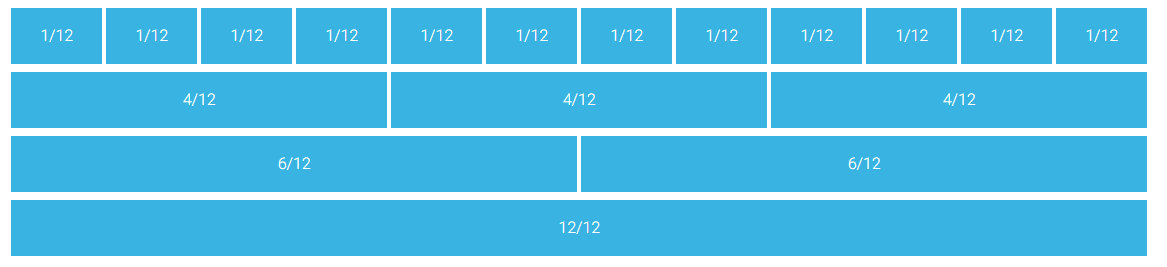
This layout is very common for web design. The width of the screen is divided into 12 columns. These columns are stored in a row. (So the example above consists of 4 rows.)
Both rows and columns are defined through div container and are placeholders for other content. The layout is made responsive through defining different columns for different screen sizes. Common breakpoints for devices and their corresponding class names are displayed in the table below:
Flexbox Grid
Download the .zip folder from flexboxgrid.com and extract it. The only necessary file is flexboxgrid.min.css inside flexboxgrid-6.31 > css. (If you want to inspect the css file, have a look at the not minified version flexboxgrid.css.) Copy the css file to your css folder and import it:
<head>
    <meta charset="utf-8">
    <title>flexboxgrid</title>
    <link rel="stylesheet" href="css/flexboxgrid.min.css">
    <link rel="stylesheet" href="css/style.css">
</head>
The following code demonstrates the basic possibilities of flexboxgrid. For more see the website.
index.html
<!DOCTYPE html>
<html>
<head>
<meta charset="utf-8">
<title>flexboxgrid</title>
<link rel="stylesheet" href="css/flexboxgrid.min.css">
<link rel="stylesheet" href="css/style.css">
</head>
<body>
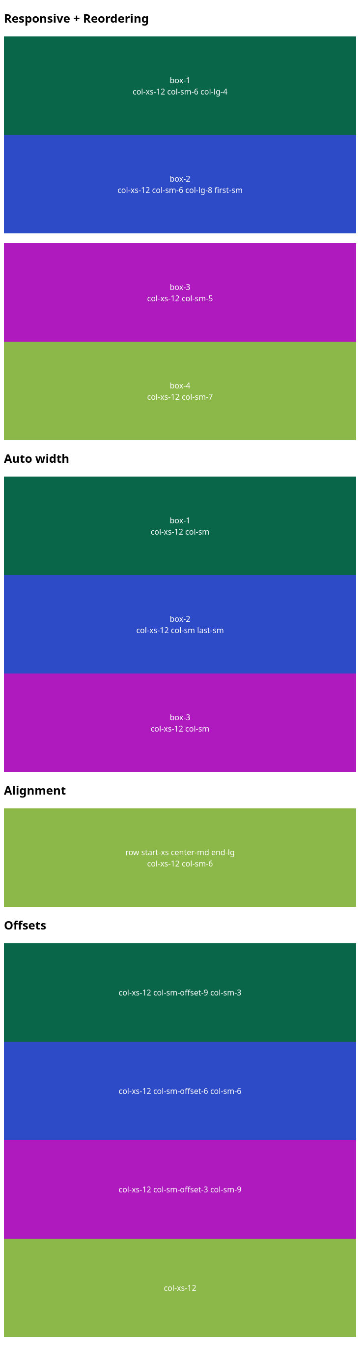
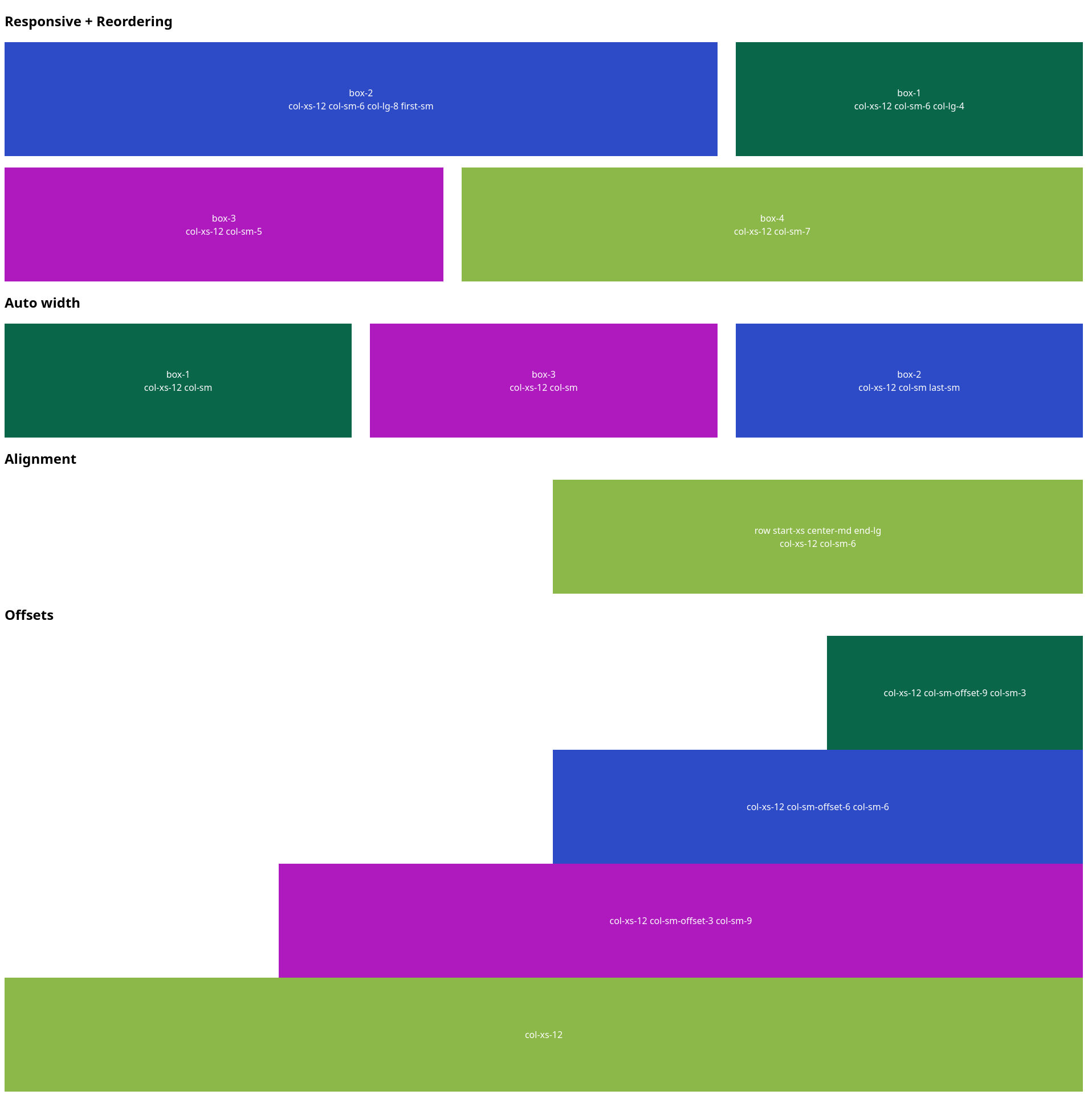
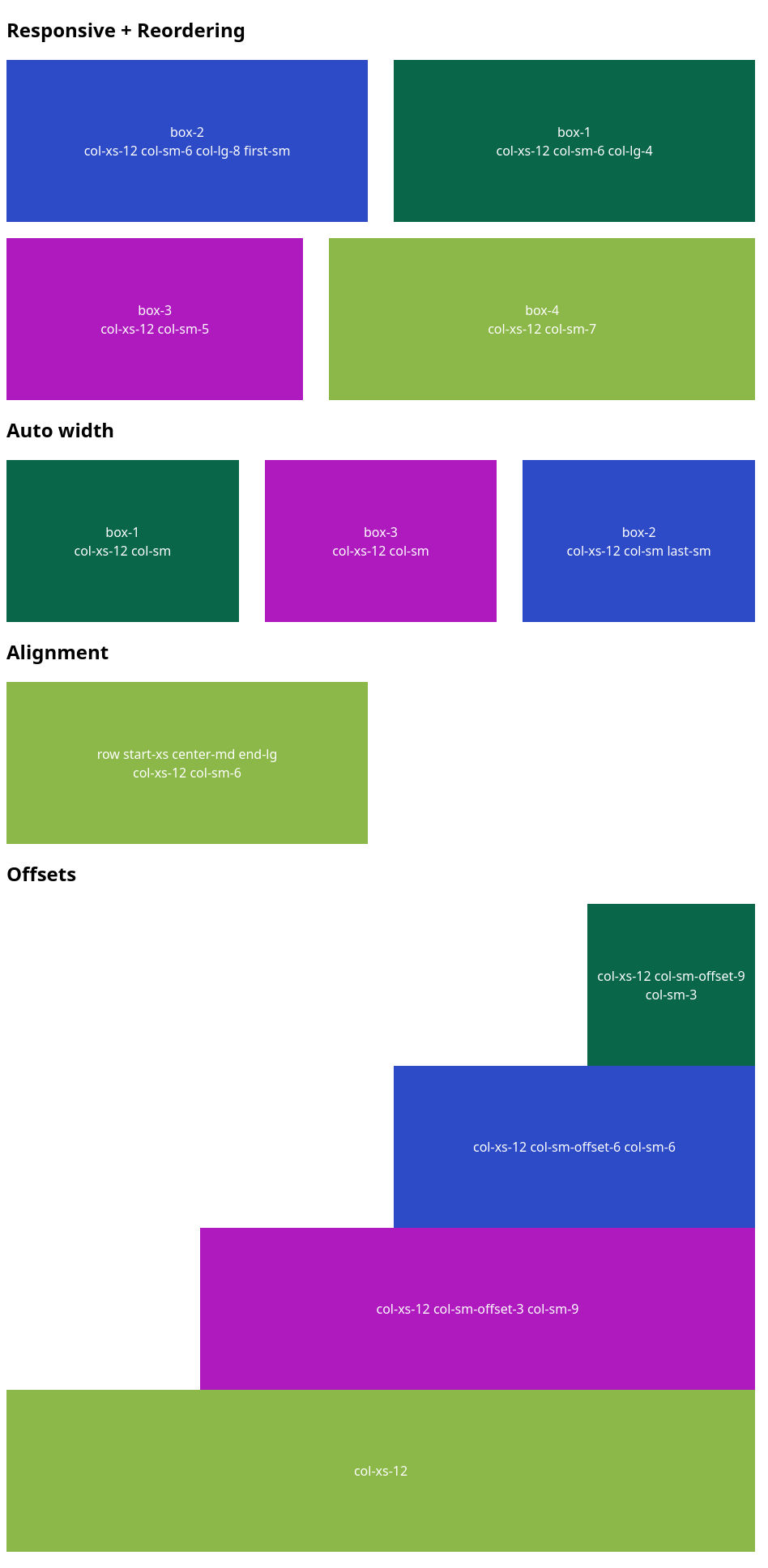
<h2>Responsive + Reordering</h2>
<div class="row">
<div class="col-xs-12 col-sm-6 col-lg-4">
<div class="box box-1">box-1<br>col-xs-12 col-sm-6 col-lg-4</div>
</div>
<div class="col-xs-12 col-sm-6 col-lg-8 first-sm">
<div class="box box-2">box-2<br>col-xs-12 col-sm-6 col-lg-8 first-sm</div>
</div>
</div>
<div class="row">
<div class="col-xs-12 col-sm-5">
<div class="box box-3">box-3<br>col-xs-12 col-sm-5</div>
</div>
<div class="col-xs-12 col-sm-7">
<div class="box box-4">box-4<br>col-xs-12 col-sm-7</div>
</div>
</div>
<h2>Auto width</h2>
<div class="row">
<div class="col-xs-12 col-sm">
<div class="box box-1">box-1<br>col-xs-12 col-sm</div>
</div>
<div class="col-xs-12 col-sm last-sm">
<div class="box box-2">box-2<br>col-xs-12 col-sm last-sm</div>
</div>
<div class="col-xs-12 col-sm">
<div class="box box-3">box-3<br>col-xs-12 col-sm</div>
</div>
</div>
<h2>Alignment</h2>
<div class="row start-xs center-md end-lg">
<div class="col-xs-12 col-sm-6">
<div class="box box-4">row start-xs center-md end-lg<br>col-xs-12 col-sm-6</div>
</div>
</div>
<h2>Offsets</h2>
<div class="row">
<div class="col-xs-12 col-sm-offset-9 col-sm-3">
<div class="box box-1">col-xs-12 col-sm-offset-9 col-sm-3</div>
</div>
<div class="col-xs-12 col-sm-offset-6 col-sm-6">
<div class="box box-2">col-xs-12 col-sm-offset-6 col-sm-6</div>
</div>
<div class="col-xs-12 col-sm-offset-3 col-sm-9">
<div class="box box-3">col-xs-12 col-sm-offset-3 col-sm-9</div>
</div>
<div class="col-xs-12">
<div class="box box-4">col-xs-12</div>
</div>
</div>
</body>
</html>
style.css
body {
    font-family: sans-serif;
}

.row {
    margin-bottom: 20px;
}

.box {
    height: 200px;
    color: white;
    display: flex;
    align-items: center;
    justify-content: center;
    text-align: center;
}

.box-1 {
    background-color: rgb(9, 102, 72);
}

.box-2 {
    background-color: rgb(45, 75, 199);
}

.box-3 {
    background-color: rgb(175, 26, 191)
}

.box-4 {
    background-color: rgb(139, 184, 72)
}
Large device
Medium device
Small device