CSS box model
div tag
The <div> tag looks very unspecific, but is actually a widely used one, as it can serve as container for all the other elements. Like:
<div>
    <h1>Writing an own website.</h1>
</div>
body each into its own div container. (Exception: If you have headlines with corresponding paragraphs of text, enclose them together in one div.)
Examples:
<div>
   <h2>A flower needs some water</h2>
   <p>Lorem ipsum dolor sit amet, con ... </p>
</div>

<div>
    <a href="https://www.uni-weimar.de" target="_blank">Link to Bauhaus University</a>
</div>
As you can see, your browser displays a line break before and after a div tag by default.
CSS box model
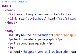
With our elements enclosed by div tags we’ll start to explore the so called box model of CSS. The display of every element is defined by the box model. It consists of the content of the element, a padding, a border and a margin. You can inspect the box model of each element with the Inspector of your browser:
Here only the size of the content (487 x 267 px) is defined, so all the other values are 0.
In your style.css file add the tag div and define its border:
div {
    background-color: rgb(132, 202, 140);
    border: 1px solid white;
}
(For different border styles see this page. For defining rounded corners see this page.)
After inspecting the results we’ll add a margin:
div {
    background-color: rgb(132, 202, 140);
    border: 1px solid white;
    margin: 10px;
}
The margin defines the space between the border and the neighboring elements. If only one value is set, it defines all 4 sides, otherwise you can define them individually:
div {
    margin-top: 10px;
    margin-right: 15px;
    margin-bottom: 20px;
    margin-left: 15px;
    /* or all together in one line */
    margin: 10px 15px 20px 15px;
}
The last part of the box model is padding. This area is in between the content and the border.
div {
    background-color: rgb(132, 202, 140);
    border: 1px solid white;
    margin: 10px;
    padding: 50px;
}
Next we’ll define the width of the img tag. We have to remove the inline styling of the img tags in index.html if we want to have all images to have the same size.
img {
    width: 25vw;
}
Of course you can also define a (maximum) width of the div tag and set the img width to 100% to fill the div container.
div element. Use resources from the web to find information about border, margin and padding.Of course you can also apply the box model styles to other elements like for e.g.
p.
CSS box-sizing
If we use margin, border and padding that way, all these values will be added to the size of our element.
overall_size = width + padding + border + margin
Sometimes this is difficult to control, for e.g. if we want to create a grid with three columns.
One solution is to use the box-sizing property. Commonly it’s applied to all elements with the following code at the beginning of a .css file:
* {
    box-sizing: border-box;
}
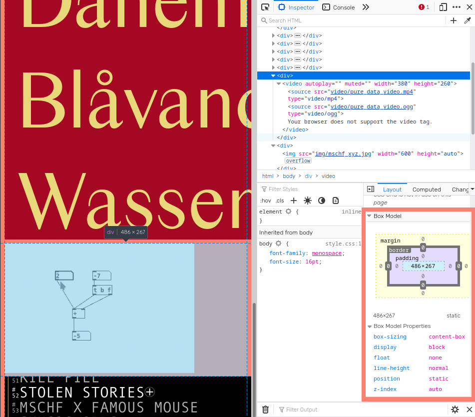
We can see the difference with the Inspector tool.
Box model without box-sizing property.
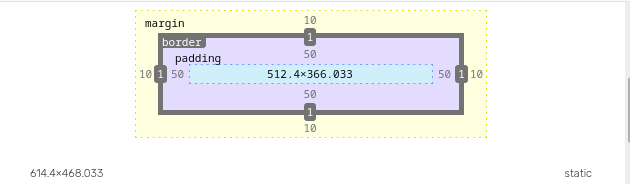
Box model with box-sizing: border-box; property.
In the first version the content takes the specified width of 32vw (614.4px). Padding, border and margin are added on all sides to result in a total width of 716px.
The latter with box-sizing: border-box applied has a full width of 32vw (614.4px). The space for the content is responsive and is = width - margin - border - padding on both sides = 512.5px.
Code summary
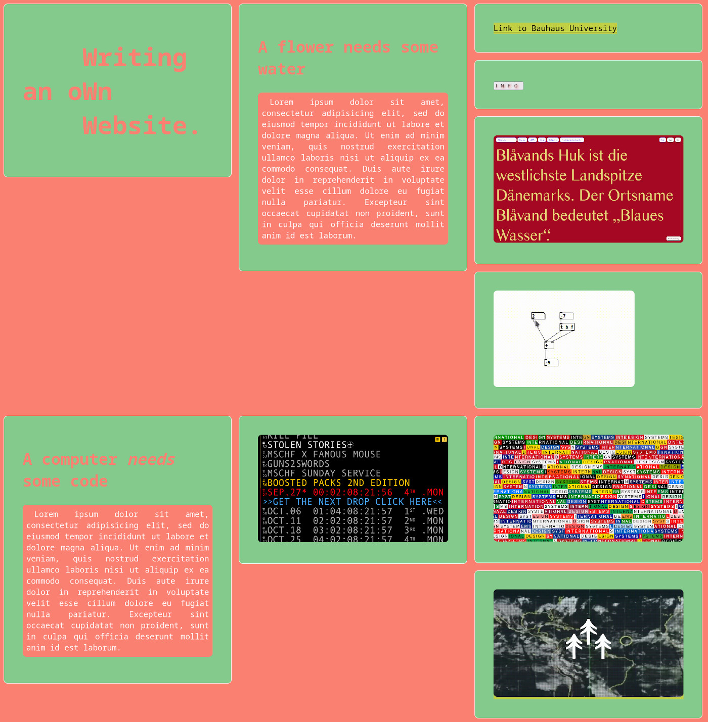
index.html
<!DOCTYPE html>
<html>
<head>
<meta charset="UTF-8">
<meta name="viewport" content="width=device-width, initial-scale=1.0">
<title>Writing an own website</title>
<link rel="stylesheet" href="css/style.css">
</head>
<body>
<div>
<h1> <span class="www">w</span>riting<br>an o<span class="www">w</span>n<br> <span class="www">w</span>ebsite.</h1>
</div>
<div>
<h2>A flower needs some water</h2>
<p>Lorem ipsum dolor sit amet, consectetur adipisicing elit, sed do eiusmod tempor incididunt ut labore et dolore magna aliqua. Ut enim ad minim veniam, quis nostrud exercitation ullamco laboris nisi ut aliquip ex ea commodo consequat. Duis aute irure dolor in reprehenderit in voluptate velit esse cillum dolore eu fugiat nulla pariatur. Excepteur sint occaecat cupidatat non proident, sunt in culpa qui officia deserunt mollit anim id est laborum.</p>
</div>
<div>
<a href="https://www.uni-weimar.de" target="_blank">Link to Bauhaus University</a>
</div>
<div>
<button id="info-button">info</button>
</div>
<div>
<img src="img/radematic_com.jpg" alt="screenshot of radematic.com">
</div>
<div>
<video width="380" height="260" autoplay muted>
<source src="video/pure_data_video.mp4" type="video/mp4">
<source src="video/pure_data_video.ogg" type="video/ogg">
Your browser does not support the video tag.
</video>
</div>
<div>
<h2>A computer <i>needs</i> some code</h2>
<p>Lorem ipsum dolor sit amet, consectetur adipisicing elit, sed do eiusmod tempor incididunt ut labore et dolore magna aliqua. Ut enim ad minim veniam, quis nostrud exercitation ullamco laboris nisi ut aliquip ex ea commodo consequat. Duis aute irure dolor in reprehenderit in voluptate velit esse cillum dolore eu fugiat nulla pariatur. Excepteur sint occaecat cupidatat non proident, sunt in culpa qui officia deserunt mollit anim id est laborum.</p>
</div>
<div>
<img src="img/mschf_xyz.jpg">
</div>
<div>
<img src="img/designsystems_international.jpg">
</div>
<div>
<a href="https://terra0.org" target="_blank">
<img src="img/terra0_org.jpg">
</a>
</div>
</body>
</html>
style.css
* {
    box-sizing: border-box;
}

body {
    font-family: monospace;
    font-size: 16pt;
    background-color: salmon;
    margin: 0;
}

div {
    width: 32vw;
    float: left;
    background-color: rgb(132, 202, 140);
    border: 1px solid white;
    margin: 10px;
    padding: 50px;
}

div, img, video {
    border-radius: 10px;
}

h1, h2 {
    color: salmon;
}

h1 {
    font-size: 3.5vw;
}

h2 {
    font-size: 32pt;
}

p {
    padding: 10px;
    border-radius: 10px;
    background-color: salmon;
    color: snow;
    text-align: justify;
    text-indent: 16pt;
}

a {
    color: black;
    background-color: hsla(50, 100%, 50%, 0.5);
}

img {
    width: 100%;
}

.www {
    text-transform: uppercase;
}

#info-button {
    text-transform: uppercase;
    text-shadow: 2px 2px 5px red;
    letter-spacing: 10px;
}
Result: