Bootstrap
Bootstrap requires next to a css file an corresponding .js file. Download the files into your css and js folder.
(Alternatively you can insert them via jsDelivr. This requires developing your web site on a localhost.)
The bootstrap grid system is based on the same flexbox property as the »flexbox grid« framework. In addition both use almost the same syntax, so we don’t have to change much from the previous code.
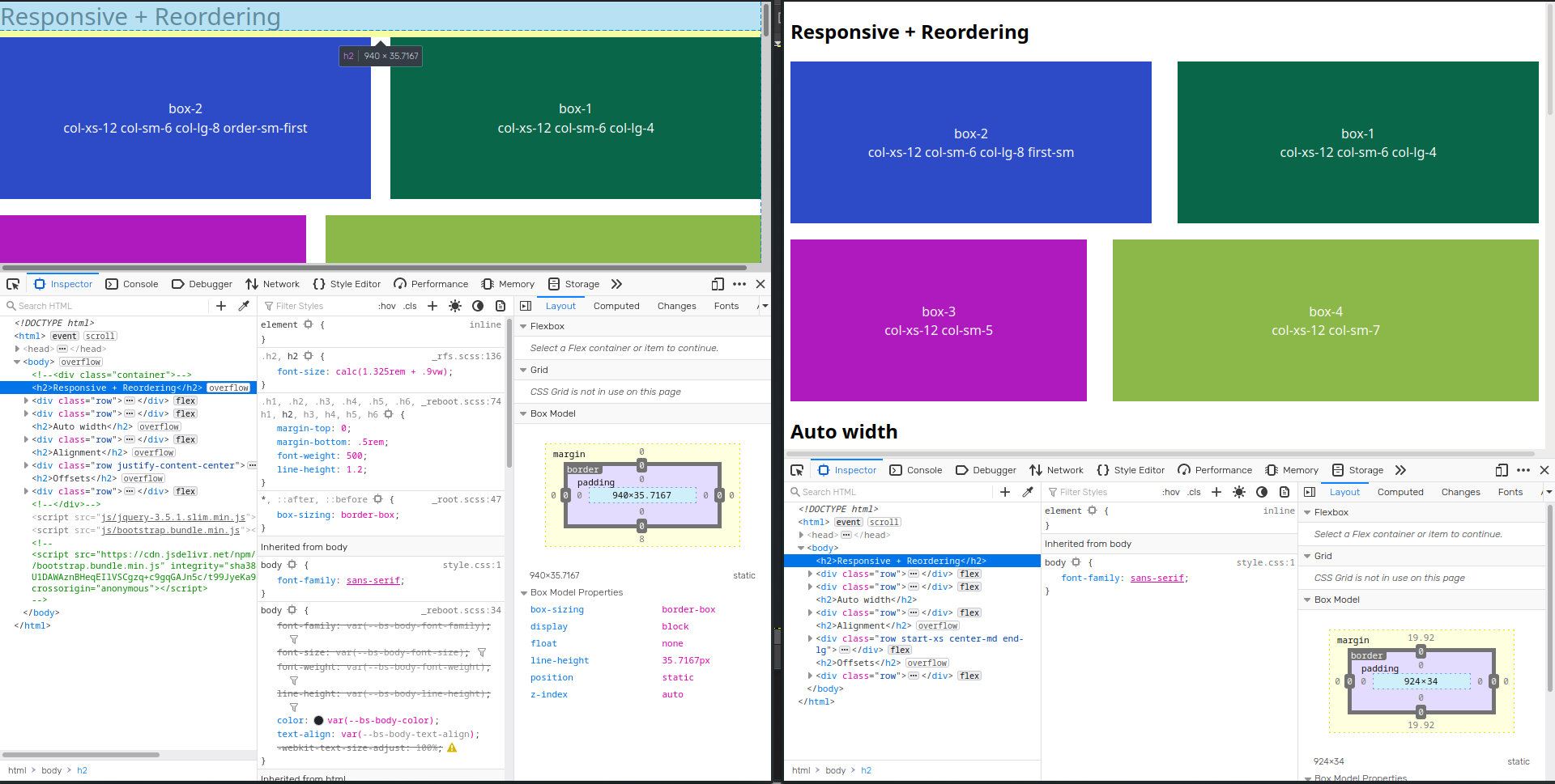
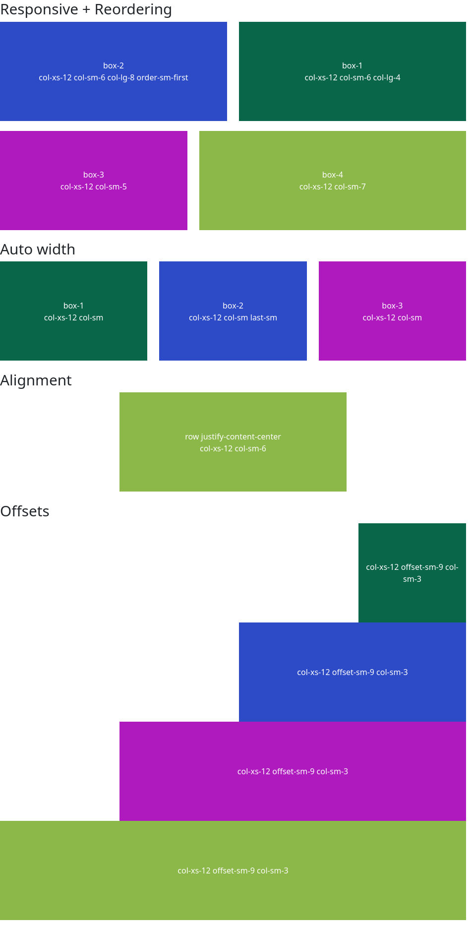
Responsiveness works right away.
Syntax for ordering is
first-sm --> order-sm-first
Syntax for alignment:
start-xs center-md end-lg --> justify-content-center
(Not responsive.)
Syntax for offset:
col-sm-offset-9 --> offset-sm-9
But the grid layout is only one part of Bootstrap. It offers easy solutions for a huge range of elements: Navbars, Modals, Accordion, Collapse, Scrollspy, …
But in return it will have an impact on your design. For e.g. if we inspect the headline we identify several attributes styled by Bootstrap. (Of course we can override all of them.) If we only need the grid layout it may be better to use
Complete layout:
index.html
<!DOCTYPE html>
<html>
    <head>
        <meta charset="utf-8">
        <title>bootstrap grid</title>
        <link rel="stylesheet" type="text/css" href="css/bootstrap.min.css">
        <!-- or onlye the grid-layout:
        <link rel="stylesheet" type="text/css" href="css/bootstrap-grid.min.css">
    -->
        <!-- <link href="https://cdn.jsdelivr.net/npm/bootstrap@5.1.0/dist/css/bootstrap.min.css" rel="stylesheet" integrity="sha384-KyZXEAg3QhqLMpG8r+8fhAXLRk2vvoC2f3B09zVXn8CA5QIVfZOJ3BCsw2P0p/We" crossorigin="anonymous"> -->
        <link rel="stylesheet" href="css/style.css">

    </head>
    <body>

        <!-- <div class="container"> -->

            <h2>Responsive + Reordering</h2>

            <div class="row">

                <div class="col-xs-12 col-sm-6 col-lg-4">
                    <div class="box box-1">box-1<br>col-xs-12 col-sm-6 col-lg-4</div>
                </div>

                <div class="col-xs-12 col-sm-6 col-lg-8 order-sm-first">
                    <div class="box box-2">box-2<br>col-xs-12 col-sm-6 col-lg-8 order-sm-first</div>
                </div>

            </div>

            <div class="row">

                <div class="col-xs-12 col-sm-5">
                    <div class="box box-3">box-3<br>col-xs-12 col-sm-5</div>
                </div>

                <div class="col-xs-12 col-sm-7">
                    <div class="box box-4">box-4<br>col-xs-12 col-sm-7</div>
                </div>

            </div>

            <h2>Auto width</h2>

            <div class="row">
                <div class="col-xs-12 col-sm">
                    <div class="box box-1">box-1<br>col-xs-12 col-sm</div>
                </div>

                <div class="col-xs-12 col-sm last-sm">
                    <div class="box box-2">box-2<br>col-xs-12 col-sm last-sm</div>
                </div>

                <div class="col-xs-12 col-sm">
                    <div class="box box-3">box-3<br>col-xs-12 col-sm</div>
                </div>
            </div>

            <h2>Alignment</h2>

            <div class="row justify-content-center">

                <div class="col-xs-12 col-sm-6">
                    <div class="box box-4">row justify-content-center<br>col-xs-12 col-sm-6</div>
                </div>

            </div>

            <h2>Offsets</h2>

            <div class="row">

                <div class="col-xs-12 offset-sm-9 col-sm-3">
                    <div class="box box-1">col-xs-12 offset-sm-9 col-sm-3</div>
                </div>

                <div class="col-xs-12 offset-sm-6 col-sm-6">
                    <div class="box box-2">col-xs-12 offset-sm-9 col-sm-3</div>
                </div>

                <div class="col-xs-12 offset-sm-3 col-sm-9">
                    <div class="box box-3">col-xs-12 offset-sm-9 col-sm-3</div>
                </div>

                <div class="col-xs-12">
                    <div class="box box-4">col-xs-12 offset-sm-9 col-sm-3</div>
                </div>

            </div>


        <!-- </div> -->

        <script src="js/jquery-3.5.1.slim.min.js"></script>
        <script src="js/bootstrap.bundle.min.js"></script>
        <!-- <script src="https://cdn.jsdelivr.net/npm/bootstrap@5.1.0/dist/js/bootstrap.bundle.min.js" integrity="sha384-U1DAWAznBHeqEIlVSCgzq+c9gqGAJn5c/t99JyeKa9xxaYpSvHU5awsuZVVFIhvj" crossorigin="anonymous"></script> -->
    </body>
</html>
style.css
body {
    font-family: sans-serif;
}

.row {
    margin-bottom: 20px;
}

.box {
    height: 200px;
    color: white;
    display: flex;
    align-items: center;
    justify-content: center;
    text-align: center;
}

.box {
    background-color: rgb(9, 102, 72);
}

.box-2 {
    background-color: rgb(45, 75, 199);
}

.box-3 {
    background-color: rgb(175, 26, 191)
}

.box-4 {
    background-color: rgb(139, 184, 72)
}