Flexbox
Flexbox is more flexible than the float property. If flexbox is used it is recommended to keep it flexible and not write too much CSS statements which could limit it’s flexibility.
The general layout is based on one flexbox container which contains all the elements that should be positioned flexible. Width and height of the items inside this container are defined (responsive) by the content and the screen size.
The CSS code for activating a flexbox on a container is
display: flex;
.flex-container {
    display: flex;
}
It is applied to a parent container which contains all the elements:
<div class="flex-container">
    <div>
        content of div 1
    </div>
    <div>
        content of div 2
    </div>
</div>
Wrap all the div containers of your page into a parent div container with the class flex-container and insert the styling from above into style.css.
Probably it looks a little bit strange:
This happens because the div tag has a styling and this is applied to the parent div with class flex-container as well.
We’ll specify that the div styling is applied to the div elements inside the parent div only:
div {
    width: 32vw;
    background-color: rgb(132, 202, 140);
    border: 1px solid white;
    margin: 10px;
    padding: 50px;
}
becomes
.flex-container div {
    width: 32vw;
    background-color: rgb(132, 202, 140);
    border: 1px solid white;
    margin: 10px;
    padding: 50px;
}
Next we’ll allow the inner elements to wrap so that they’re not placed all in one row.
.flex-container {
    display: flex;
    flex-wrap: wrap; /* options: wrap, nowrap, wrap-reverse */
}
See more options for the flex container.
Overview
/* Activate flexbox on a container. */
.flex {
    display: flex;
}

/* Direction. */
.flex {
    display: flex;
    flex-direction: row; /* default */
    flex-direction: column; /* stack */
    flex-direction: row-reverse;
    flex-direction: column-reverse;
}

/* Align inner items. */
.flex {
    display: flex;
    justify-content: flex-start; /* default */
    justify-content: flex-end;
    justify-content: center;
    justify-content: space-between;
    justify-content: space-around;
}

/* Wrap items in additional rows if necessary. */
.flex {
    display: flex;
    flex-wrap: wrap;
}
Responsive Flexbox
With flexbox it’s possible to define the behaviour of a layout in relation to the screen size of the viewer. Depending on the screen width the flex-direction switches between row and column.
.flex-container {
    display: flex;
    /* default flex-direction is row */
}

@media (max-width: 992px) {
  .flex-container {
      flex-direction: column;
  }
}
Accordingly the size of the items inside the flex-container will adapt:
.flex-container > div {
    flex: 30%;
}

@media (max-width: 992px) {
    .flex-container > div {
        flex: 100%;
    }
}
This leads to a 3 column layout on large devices and a 1 column layout on small devices.

The corresponding code:
index.html
<!DOCTYPE html>
<html>
<head>
<meta charset="UTF-8">
<meta name="viewport" content="width=device-width, initial-scale=1.0">
<title>Writing an own website</title>
<link rel="stylesheet" href="css/fonts.css">
<link rel="stylesheet" href="css/style.css">
</head>
<body>
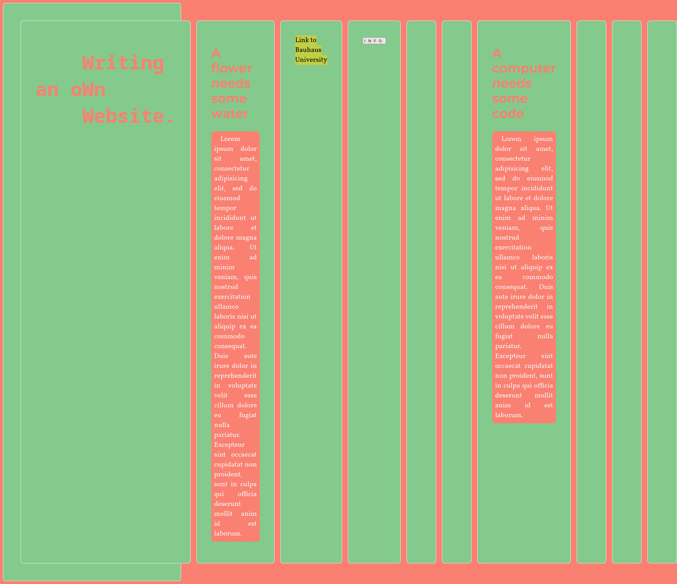
<div class="flex-container">
<div>
<h1>writing<br>an own<br>website</h1>
</div>
<div>
<h2>A flower needs some water</h2>
<p>Lorem ipsum dolor sit amet, consectetur adipisicing elit, sed do eiusmod tempor incididunt ut labore et dolore magna aliqua. Ut enim ad minim veniam, quis nostrud exercitation ullamco laboris nisi ut aliquip ex ea commodo consequat.</p>
</div>
<div>
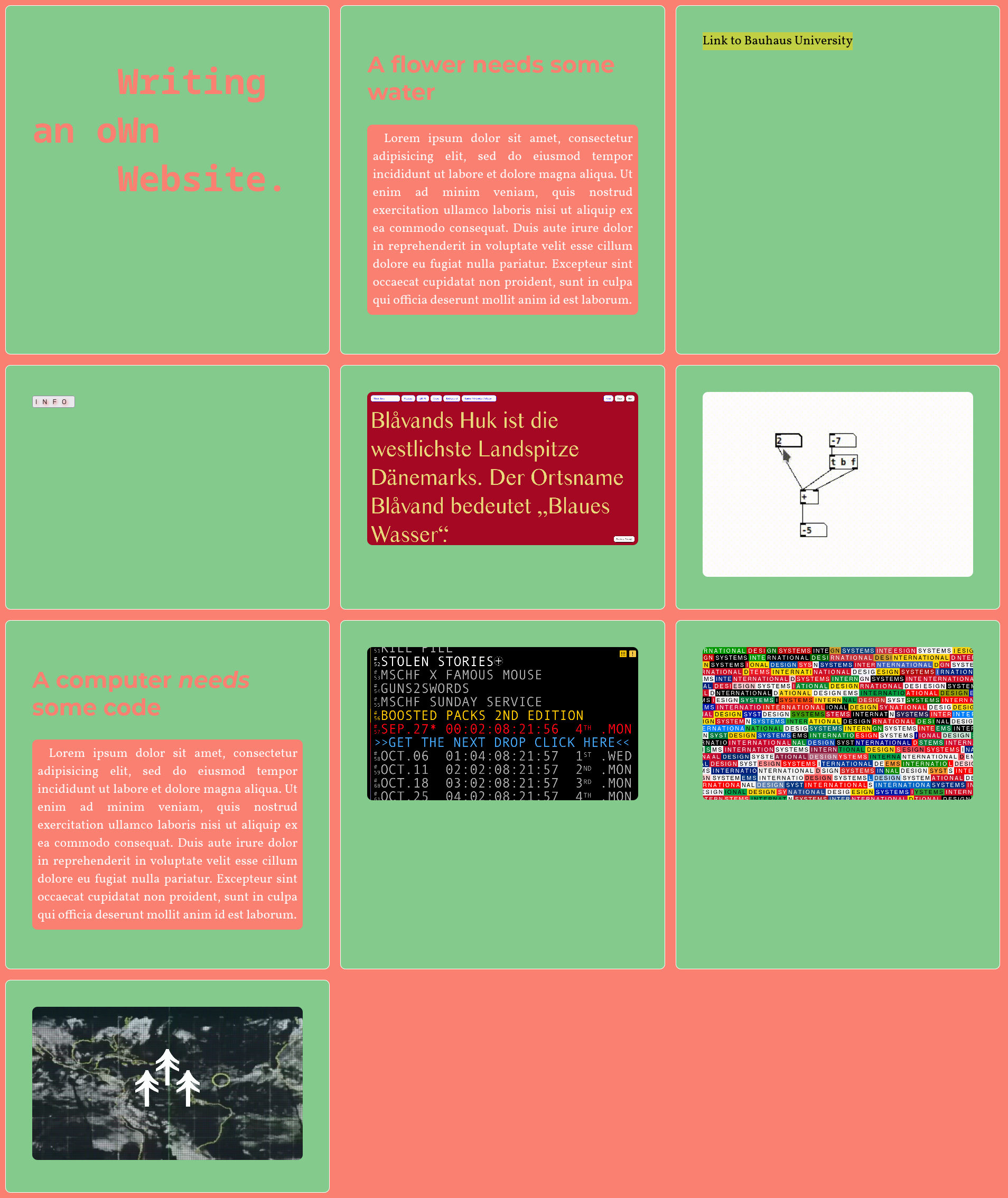
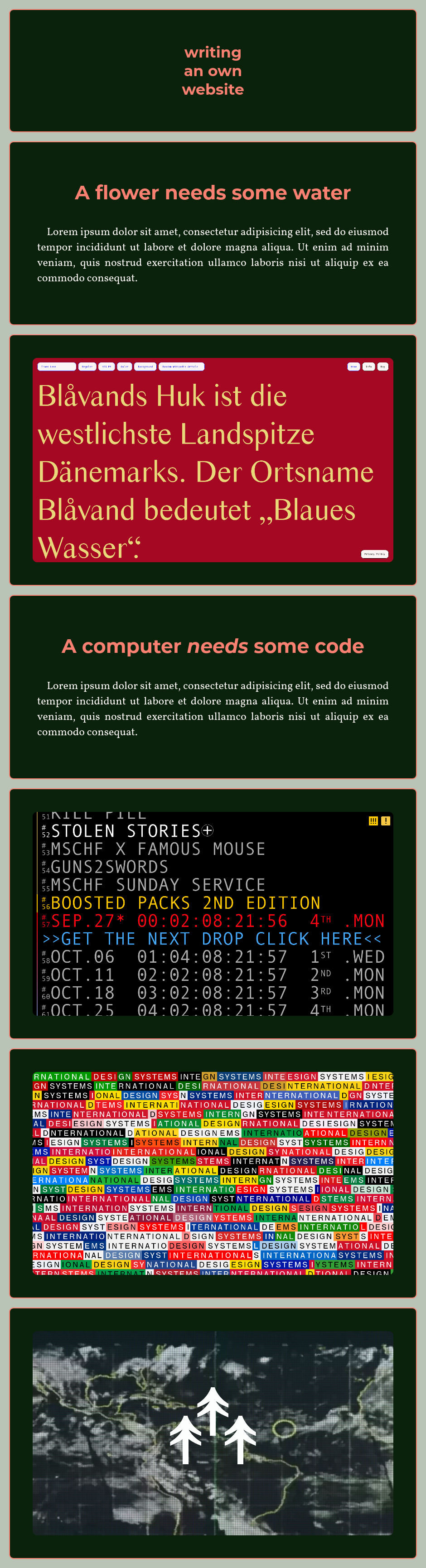
<span class="img-center-helper"></span><img src="img/radematic_com.jpg" alt="screenshot of radematic.com" width="600" height="auto">
</div>
<div>
<h2>A computer <i>needs</i> some code</h2>
<p>Lorem ipsum dolor sit amet, consectetur adipisicing elit, sed do eiusmod tempor incididunt ut labore et dolore magna aliqua. Ut enim ad minim veniam, quis nostrud exercitation ullamco laboris nisi ut aliquip ex ea commodo consequat.</p>
</div>
<div>
<span class="img-center-helper"></span><img src="img/mschf_xyz.jpg">
</div>
<div>
<span class="img-center-helper"></span><img src="img/designsystems_international.jpg">
</div>
<div>
<a href="https://terra0.org" target="_blank" style="background-color: unset;">
<span class="img-center-helper"></span><img src="img/terra0_org.jpg">
</a>
</div>
</div>
</body>
</html>
style.css
* {
    box-sizing: border-box;
}

body {
    font-family: 'Vollkorn';
    font-size: 1.5em;
    background-color: rgb(185, 195, 182);
    margin: 0;
}

.flex-container {
    margin: 20px;
    display: flex;
    flex-wrap: wrap;
    gap: 20px 20px;
    justify-content: space-around;
}

.flex-container div {
    flex: 30%;
    background-color: rgb(10, 34, 12);
    border: 2px solid salmon;
    padding: 50px;
}

@media (max-width: 992px) {
  .flex-container {
      flex-direction: column;
  }
  .flex-container div {
      flex: 100%;
  }
}

.flex-container div, p, img, video {
    border-radius: 10px;
}

h1, h2 {
    font-family: 'Montserrat';
    color: salmon;
    text-align: center;
}

h1 {
    font-size: 3.5vw;
}

h2 {
    font-size: 32pt;
}

p {
    padding: 10px;
    color: snow;
    text-align: justify;
    text-indent: 16pt;
}

a {
    text-decoration: none;
}

.img-center-helper {
    display: inline-block;
    height: 100%;
    vertical-align: middle;
}

img {
    width: 100%;
    vertical-align: middle;
}
The space between the items is not defined via margin. Instead it’s defined in the parent flex-container:
.flex-container {
    display: flex;
    flex-wrap: wrap;
    row-gap: 10px;
    column-gap: 20px;
    /* or both in one line:
    gap: 10px 20px; */
}